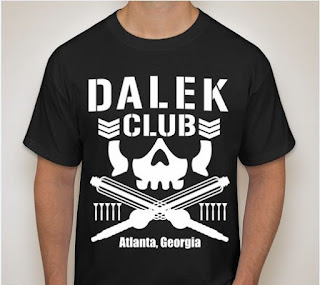
What happens when you're a pro-wrestling fan AND a Doctor Who fan? You make a ridiculous homage/rip-off/parody logo for a t-shirt!
So, the Bullet Club is by far the most over stable in professional wrestling. (Translation: The Bullet Club is by far the most popular group/alliance of wrestlers in professional wrestling) Because of that, there are tons of derivative logos that are official merchandise. BUT! Fans do the same thing. Like this one.
This is the original. Designed by an artist commissioned by Prince Devitt aka Fergal Devitt (the founder of Bullet Club). The origin of the name comes from pro-wrestling terms. You're either a worker (work the crowd/stay on script/follow the pre-determination of the match when wrestling) or a shooter (go off script/do whatever you want/intentionally hurt your opponent/win the match that's not supposed to happen). Devitt proclaimed himself as a "shooter." So the idea of the logo features guns and bullets to represent that. It also looks tough and badass. Stylized skull, crossed AK-47s, and bullets.
For the Doctor Who shirt, I kept the skull and chevrons but replaced the AKs with crossed Dalek guns. You know, the things that look like whisks. For the bullets, I decided on replacing those with the infamous sucker arm. The toilet plunger things. To accomplish this, I did it all in Flash by *cough cough* tracing *cough cough* over the skull to keep that shape. I found a typeface similar to the one used in the original to say "Dalek Club." The gun arms and suckers were created from shapes an converted to symbols for easier placement. Seen here:
I submitted this to a t-shirt screen printing company hoping they had no idea this was a Bullet Club parody shirt. However, the ONLY problem was the use of the word "Dalek." HA! So, after some adjustments, I had to add a location. Since this shirt was done for a Doctor Who con for my buddy and I to wear there, I just added the con's location: Atlanta, GA.
Turns out, that's all I needed. And below is what it looks like worn in the design proof image:
Thursday, June 7, 2018
Fun with fake logos!
This was a fun side personal project I did for a fake karaoke feud. A local friend hosted karaoke in a small town and I was the "big city" bad guy. So I created a fake karaoke brand and logo and even did a t-shirt run.
First up is the main karaoke logo:
I wanted this to be a typical and cheesy looking logo and it even features the Atlanta skyline. All of this was done in Flash.
Second is the fake hipster bar where I hosted:
A fictional bar located in O4W in Atlanta called the Beard and Sailor. I designed this with the most cliche looking hipster design that is seen everywhere. The beard and sailing wheel were free to use vector clip art. Again, designed in Flash.
Up next, the fictional brewing company:
The Yanes Brewing company. I think I used some brewery name generator for the name. The signature brew was definitely generated to have the most hipster sounding beer imaginable: The Saffron-infused Saddle Sore American Lager.
The logo was designed in Flash and I wanted that generic coaster looking type of look.
Lastly, and the logo I'm most proud of:
The "official" organization that sanctioned my karaoke: The Nippon Karaoke League. Located in Japan - the origin of karaoke. Having this seal of approval means my fake karaoke was legit. This one I had a lot of fun with. I wanted that Japanese company look but with the weird cuteness often found in Japanese logos. A smiling microphone over the Japanese sun. This was so popular, people wanted shirts with just this logo. Seen below is the shirt logo with the name of the League above it:
Again, design in Flash.
Here are the shirt proofs for the t-shirt runs I did:
The main Big City shirt with all of the sponsors and official sanctioning logo. I wanted it to look like those running shirts with logos covering the shirt in a really tacky way.
And the NKL shirt:
First up is the main karaoke logo:
I wanted this to be a typical and cheesy looking logo and it even features the Atlanta skyline. All of this was done in Flash.
Second is the fake hipster bar where I hosted:
A fictional bar located in O4W in Atlanta called the Beard and Sailor. I designed this with the most cliche looking hipster design that is seen everywhere. The beard and sailing wheel were free to use vector clip art. Again, designed in Flash.
Up next, the fictional brewing company:
The Yanes Brewing company. I think I used some brewery name generator for the name. The signature brew was definitely generated to have the most hipster sounding beer imaginable: The Saffron-infused Saddle Sore American Lager.
The logo was designed in Flash and I wanted that generic coaster looking type of look.
Lastly, and the logo I'm most proud of:
Again, design in Flash.
Here are the shirt proofs for the t-shirt runs I did:
The main Big City shirt with all of the sponsors and official sanctioning logo. I wanted it to look like those running shirts with logos covering the shirt in a really tacky way.
And the NKL shirt:
Subscribe to:
Comments (Atom)


